
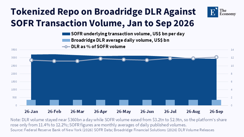
Figure: The largest tokenized repo platform handles just over a tenth of SOFR volume. Related articles:
Read More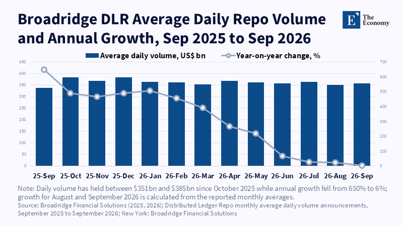
Figure: Volume plateaued near $360bn a day as annual growth fell from 650 percent to 6 percent. Related articles:
Read More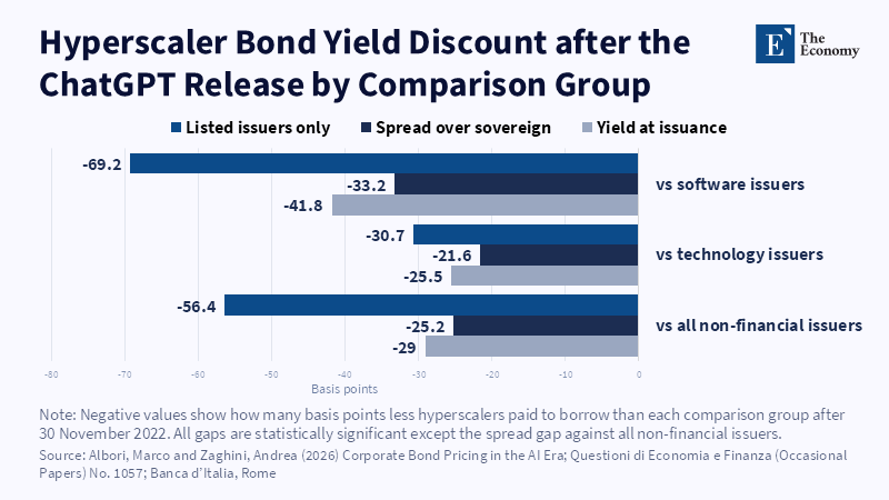
Figure: The discount is largest against software issuers, 42 basis points at issuance and 69 among listed firms and holds under every measure. Related articles:
Read More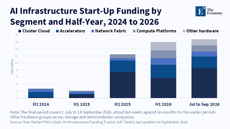
Figure: Neoclouds took the largest share in each of the last four periods and ten weeks of 2026 drew more capital than the whole first half. Related articles:
Read More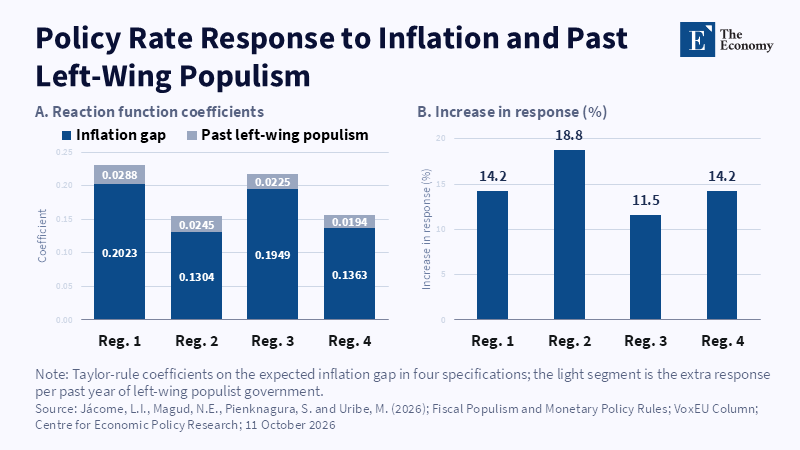
Figure: Each past year of left-wing populism makes today’s central bank react 11.5% to 18.8% harder to the same inflation gap. Related articles:
Read More





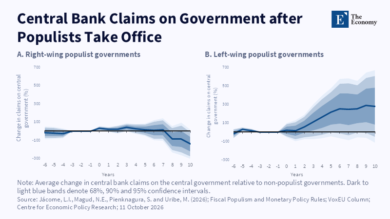
Figure: A decade after left-wing populists take office, central bank claims on the state are up close to 300%, while right-wing governments leave no lasting rise. Related articles:
Read More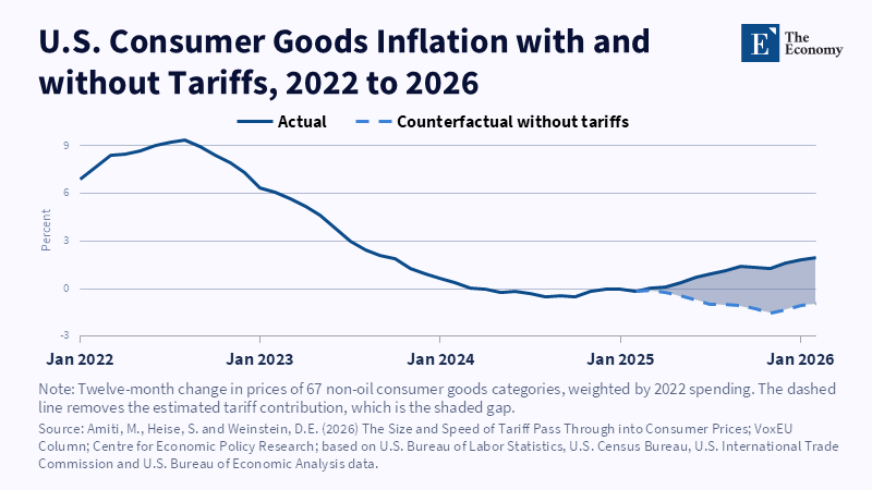
Figure: Tariffs opened a 2.9 point gap by February 2026; without them, goods prices would have been falling. Related articles:
Read More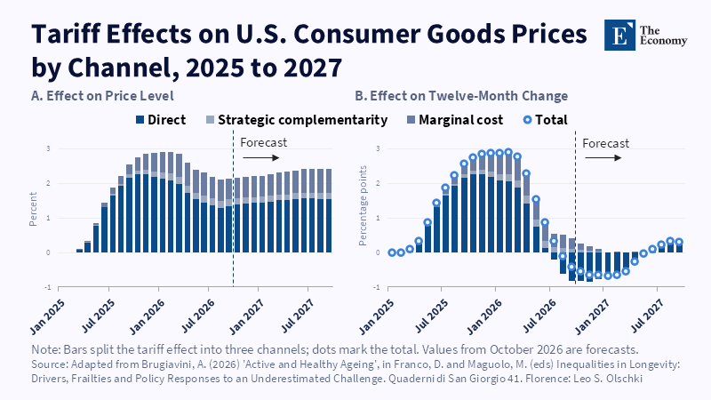
Figure: The inflation push fades to zero by August 2026, but the price level stays about 2% higher. Related articles:
Read More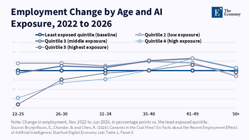
Figure: Only the youngest workers fall behind in the most exposed jobs; by the mid-thirties the gap has disappeared. Related articles: [Howie Chang Series] Will
Read More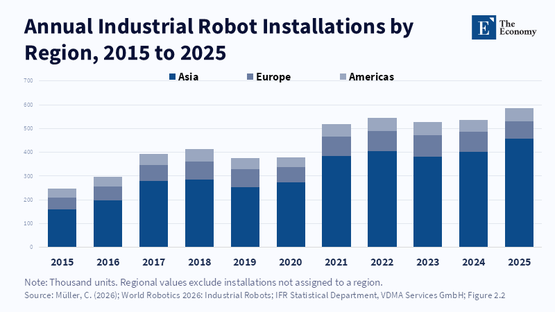
Figure: Robot installations have grown for a decade and Asia now absorbs three in every four. Related articles: [Howie Chang Series] Will Your Job be Replaced
Read More
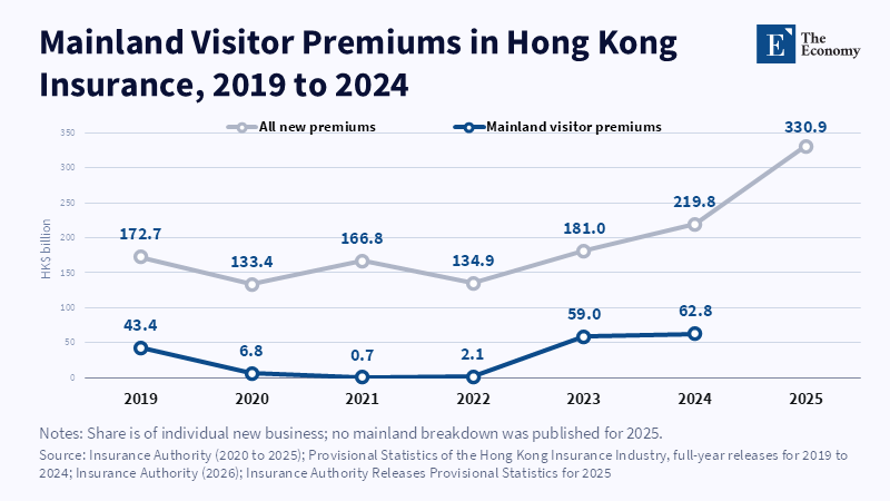
Figure 1: Mainland buyers came back to a third of new sales once the border reopened.
Read More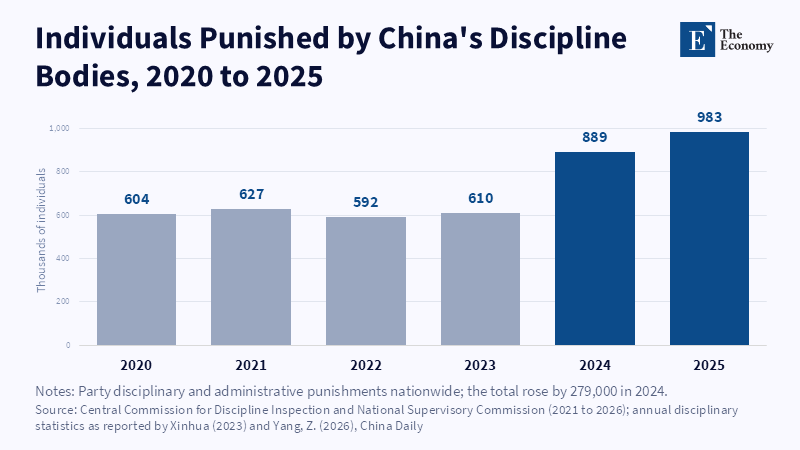
Figure: Punishments held near 600,000 for four years, then jumped 46 percent in 2024, the same year Beijing reopened channels to Hong Kong. Related articles:
Read More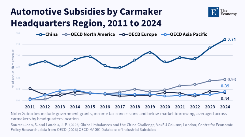
Figure: Chinese carmakers received subsidies worth 2.7 percent of revenue in 2024, nearly three times the North American rate and about seven times Europe’s. Related articles:
Read More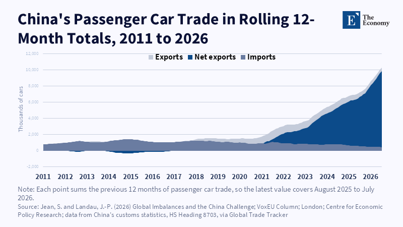
Figure: China imported more cars than it exported until 2017.
Read More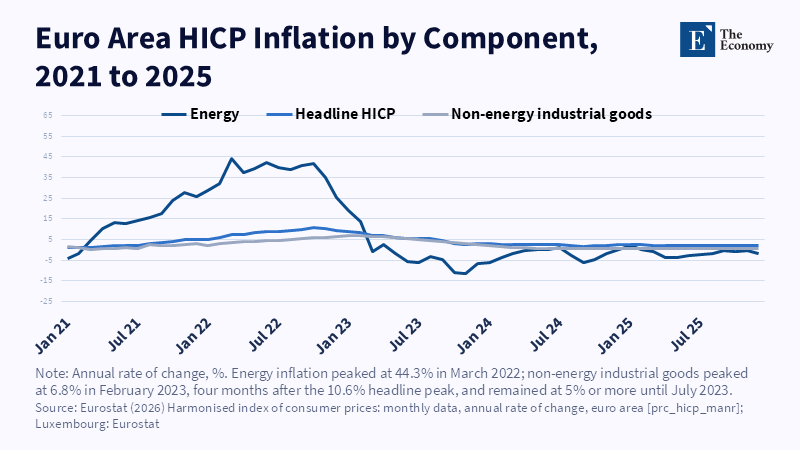
Figure: Energy inflation peaked in March 2022, but manufactured goods prices kept rising until February 2023, as the gas shock worked its way through factory costs. Related articles:
Read More
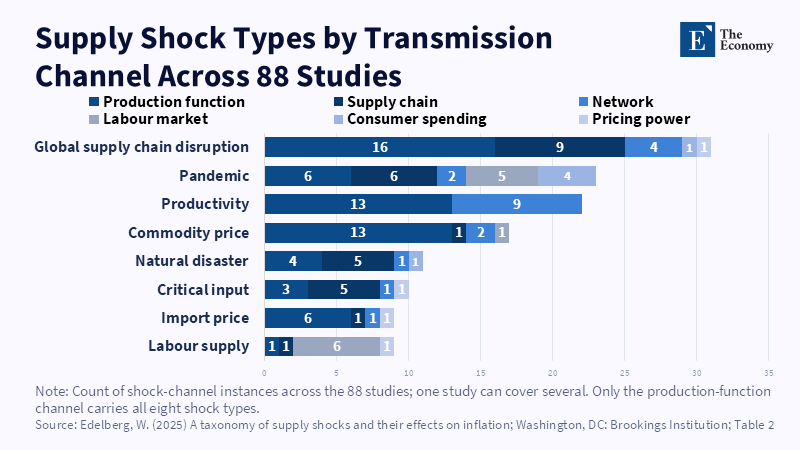
Figure: Commodity price shocks reach prices almost entirely through production costs, while supply chain and pandemic shocks spread across five channels at once. Related articles:
Read More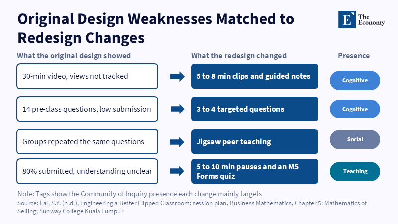
Figure: Each change answers a specific failure Lai observed, rather than adding technology for its own sake. Related articles: Redesigning
Read More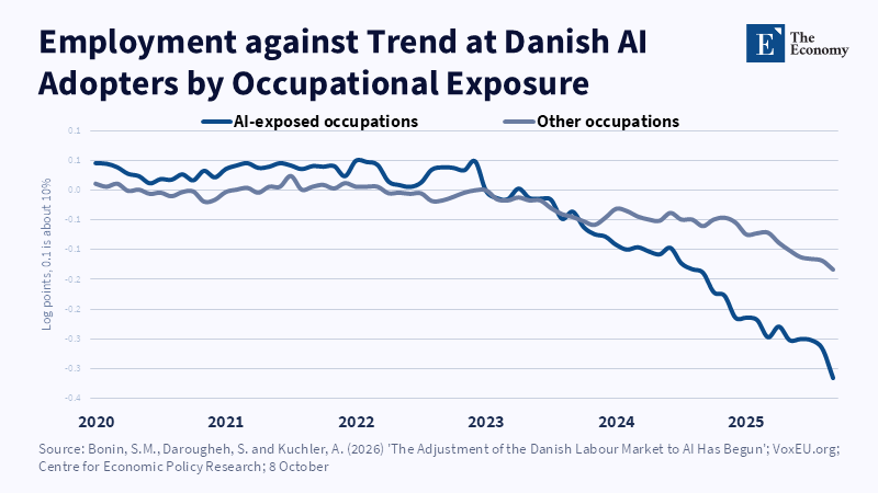
Figure: Exposed and unexposed jobs moved together until early 2023, after which the exposed line fell more than twice as far. Related articles:
Read More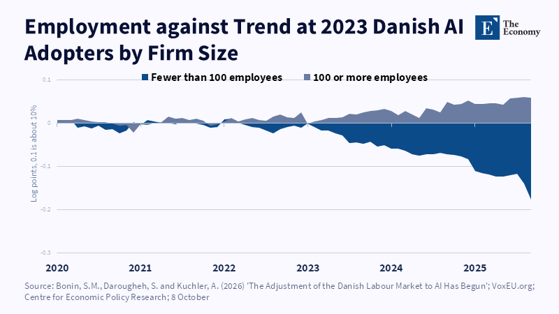
Figure: After adoption, small firms fell 16% below their own trend while larger firms edged above theirs. Related articles: AI and the D
Read More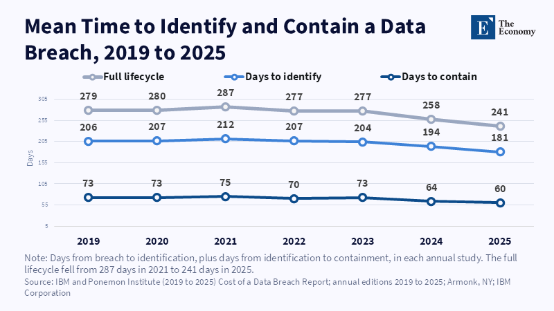
Figure: Breach lifecycles shortened by 46 days from 2021 to 2025, mostly at detection. Related articles: [Howie Chang Series] Is AI in Cybersecuri
Read More